Philippine Currency Redesign
Redesign of the Philippine's 50 Peso Banknote

I conceptualized and redesigned the Philippine's 50 Peso currency bill within a one-week time frame. This redesign upholds current currency standards and guidelines while incorporating traditional Filipino symbols and national elements. Overall, this redesign highlights a seamless blend of heritage and modern aesthetics, reflecting cultural pride and innovation in the design.
I conceptualized and redesigned the Philippine's 50 Peso currency bill within a one-week time frame. This redesign upholds current currency standards and guidelines while incorporating traditional Filipino symbols and national elements. Overall, this redesign highlights a seamless blend of heritage and modern aesthetics, reflecting cultural pride and innovation in the design.
My Role
My Role
Designer
Researcher
Designer
Researcher
Timeline
Timeline
August 2024 (1 Week)
August 2024 (1 Week)
Tools
Illustrator
Photoshop
Procreate
Illustrator
Photoshop
Procreate
Context/Research
Overview
Overview
What is the Philippines known for? For this project, I started with researching the Philippine’s background. I did so by compiling a vision board of their national symbols, their biggest exports, and the designs and embroidery on traditional clothing.
What is the Philippines known for? For this project, I started with researching the Philippine’s background. I did so by compiling a vision board of their national symbols, their biggest exports, and the designs and embroidery on traditional clothing.

After obtaining a solid understanding of the visual elements and current currency standards, I began the ideation phase by sketching 6 different variations.
After obtaining a solid understanding of the visual elements and current currency standards, I began the ideation phase by sketching 6 different variations.

Prototypes
After narrowing it down to one sketch, I refined it to create my first prototype iteration, but I wasn’t entirely satisfied with certain elements of this design. Mainly, the text color and placement, along with the lack of patterns. I also thought the security strip seemed out of place. Additionally, I received feedback that I needed to fill the negative space near the top of the design.
After narrowing it down to one sketch, I refined it to create my first prototype iteration, but I wasn’t entirely satisfied with certain elements of this design. Mainly, the text color and placement, along with the lack of patterns. I also thought the security strip seemed out of place. Additionally, I received feedback that I needed to fill the negative space near the top of the design.
First Version
First Version
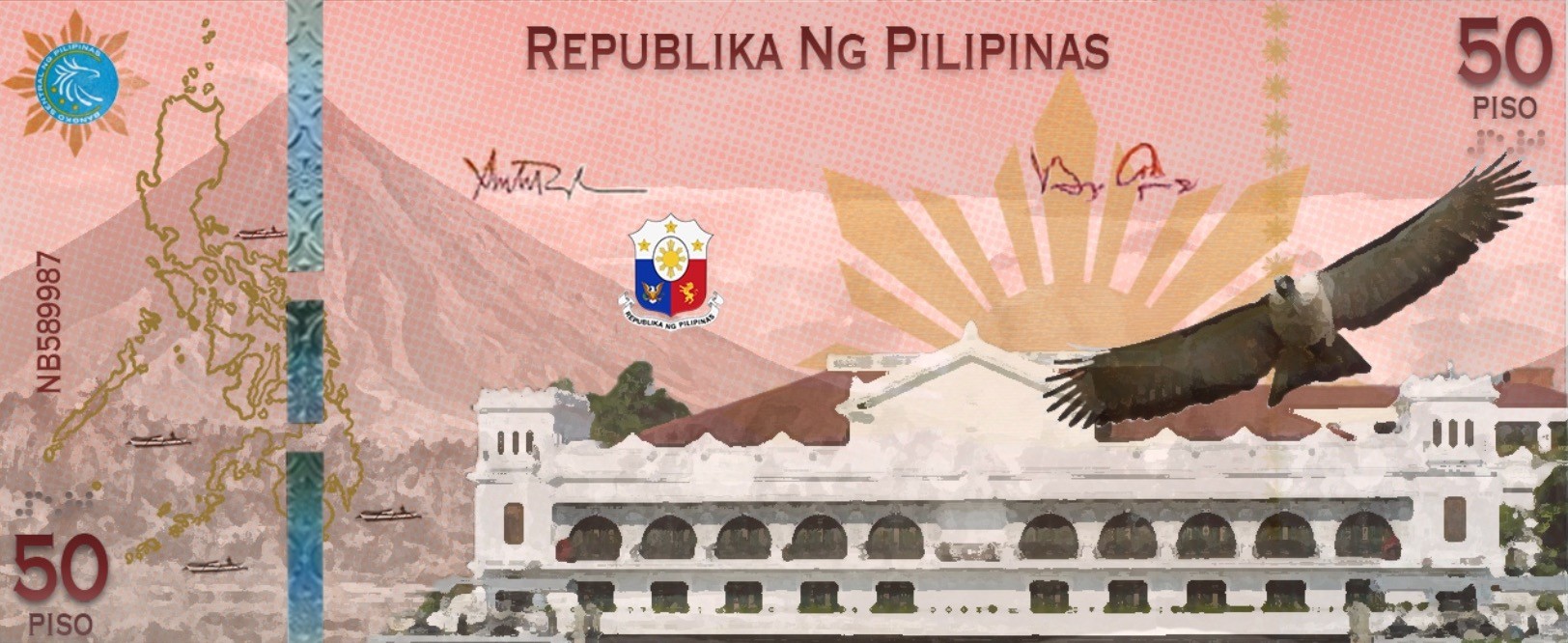
After receiving a round of feedback, I went ahead and applied it to my prototype by changing the color and placement of the text to make it contrast more with the background. Additionally, I added a pattern overlay to the currency and a small decorative border composed of the sun found on the Philippine’s flag. I also changed the color of the security strip to better fit in with the design’s overall color scheme. After implementing these changes, I designed the back of the currency in the same theme. Since the overall goal of this currency redesign was to consistently maintain the concept of background, middle ground, and foreground, I ensured I kept these elements without losing the integrity of the design. Overall, this was a rewarding and fun project that allowed me to explore facets of my mother’s culture as well as effectively apply design concepts.
After receiving a round of feedback, I went ahead and applied it to my prototype by changing the color and placement of the text to make it contrast more with the background. Additionally, I added a pattern overlay to the currency and a small decorative border composed of the sun found on the Philippine’s flag. I also changed the color of the security strip to better fit in with the design’s overall color scheme. After implementing these changes, I designed the back of the currency in the same theme. Since the overall goal of this currency redesign was to consistently maintain the concept of background, middle ground, and foreground, I ensured I kept these elements without losing the integrity of the design. Overall, this was a rewarding and fun project that allowed me to explore facets of my mother’s culture as well as effectively apply design concepts.
Final Version
Final Version

Front
Front
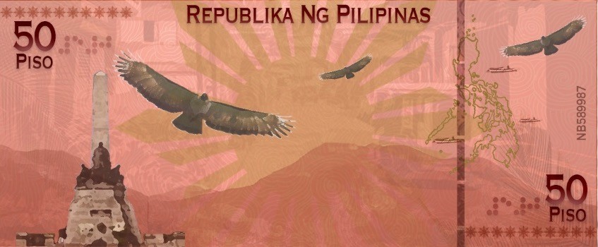
Back
Back
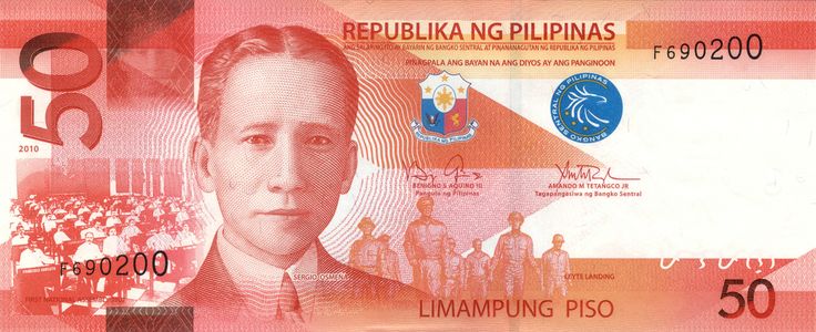
Additionally, I studied the actual banknote in great detail in order to accurately capture all of the necessary elements
Additionally, I studied the actual banknote in great detail in order to accurately capture all of the necessary elements
Created with love ❤️ by Elise Hart